I was going to blog yesterday but I literally didn't have the time; largely because I spent the entire day finishing concept work and putting together my presentation for today's pitch. As I write this, I am currently sitting on Floor 7 at uni and shitting myself about the up-and-coming pitch, even though I'm fairly prepared.
I spent the whole day yesterday producing art work to use in this pitch. This consisted of a character design for the villain in full colour, and two concept pieces to convey the character's relationship before and after the coin is inserted. These two pieces also hopefully sum up how I intend to use colour to transition between peace and chaos and also to continuously establish the contrast between these two characters.
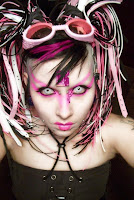
Here is the fully coloured and textured image of my villain character. I attempted to paint the multi coloured streaks that a lot of cybergoths have, in this image, but it didn't quite work well.
And here are the two images that go at the beginning to convey the complex relationship these characters have. When the arcade machine is not in use, they are living, breathing and feeling characters; but once the game starts, they are merely entities, designed for fighting and the satisfaction of the player.
I know that Blogger are making some changes to the interface, but with any luck, you should be able to view these images full size by clicking on them. In between each of these images, I have included these videos to show the transition to chaos in true arcade style.
I will also need to stress that this film will loosely follow a cyberpunk style and that I will need the following specialists to join my team:
Storyboard Artists
Environmental Designers
Character and Environmental Modellers
Some more Animators
Texture Artists
Rendering Specialists
Sound Designers (perhaps from the Sound Design degree at Rave)
I have already seen quite a few impressive pitches today so I hope that mine goes down well. Only problem is that it has been quite a strain to hear a lot of them because of the noise from other courses (welcome to the new age of open learning at Ravensbourne :P)
I have finally moved on to developing the colour schemes of the characters. Well, with the hero anyway. I have just spent the past few hours in Photoshop tracing a drawing of the hero character and then colouring him in. I was going to paint it seen as I'm not that hot with a graphics tablet, but I decided that it would be better to experiment with colour and texture through digital means as this gives me an opportunity to see what works when it comes to texturing and also to experiment with more than one colour scheme on the same character.
Here is the design as it looks now.
The colour scheme may be subject to change but this will perhaps be left until after I have finalised the villain's design and colour scheme as I will be able to work at making their colours either complementary or contrasting to one another. I am also keen on designing this character so that he slightly alters his colour depending on his mood.
The neon effect that I have created was done by colouring in the illuminated areas in a separate layer and then duplicating that layer. I then applied the Drop Shadow, Inner Shadow, Outer Glow, Bevel and Emboss and Colour Overlay Effects and I tweaked them, using this tutorial on creating a neon light effect in Photoshop. At first, I followed this tutorial to the letter, but I eventually began customising it by myself to suit the look of the character.
The circuit board effect was done just by getting a photo of a circuit board and then using the clone tool. I changed that Layer from Normal to Overlay to make it look as if this is contained inside the joints of this character.
Please feel free to give me any feedback on this character and also any suggestions for possible names will be welcome!
Here is an initial drawing of the villain character in her cybergoth guise. I will need to start working with colour soon but I am pretty sure I am going to use a colour scheme of black and red (and possibly some other warm colours) to convey the character as a villain.
In order to come up with this character, I looked up various items of cybergoth fashion and then drew into this design. As I do more sketches, I will need to make her seem more warrior like because at the moment, this just looks like a fashion illustration, rather than a character design for a short animated film concept.
Using the cybergoth photos that I posted up in the previous post, I have been trying to sketch what the villain's face should look like. A key element of the cybergoth look is the really massive hair that more often than not has more than one colour running through it. A lot of cybergoths also go for the chunky goggles; something that I have chosen to include in my character.
Cybergoth hair is considerably tricky to get right through drawing. If recreating it in Maya is anywhere near as difficult as drawing it, I may need to reconsider the design. I think the best thing to do is start using paint and incorporating various colour schemes; so this will require some fairly thick and bright acrylics as this will help to convey the cybergoth image better than these monochromatic doodles.
There are certain things about the character's image that I have decided on through these sketches, however; I have decided that the character will have goggles, which could also be used to symbolise the character coming in and out of a warrior-like state. I have also drawn the goggles so that they rest at an angle on her head.
In order to make her face look more different to that of the hero's, I have decided to make her eyes considerably larger than the rest of her face. I think this will be quite effective in creating emotion in the character, as well as establishing her transition from quite a loving character to the villain that she becomes when a coin is inserted and the game is in play.
I feel that I'm on to something with the whole cyberpunk style; it is a very vibrant and abstract style and has some eerie undertones. This would be perfect for the theme of my short film concept.
As for the design of the female villain character, I feel that I have been looking too squarely at video game characters to base them on and I think that I needed to look elsewhere for inspiration. In doing some reading on cyberpunk, I came across a fashion style called cybergoth; a style which fuses cyberpunk with the gothic subculture among other influences.
I had heard of cybergoth before but I hadn't looked into it in any great depth beforehand. It is quite distinctive with the big, usually multicoloured hairdos and quite tightly fitted shirts/corsets/dresses with colour schemes of varying levels of diversity.
To me, the cybergoth fashion and culture is very beautiful. It is really elaborate and unusual, but looks amazing when perfected; some of the cybergoths that dress in relatively dark colour schemes mixed with warm colours such as red almost look villainous This is the sort of thing that may inform the look of my villain character as I will need to convey the sense of beauty that is inherent in this character and clearly establish the fact that this character was designed to be a villain in the game in which she exists.
Here are some more images that I will use as reference for creating this character.
Here is another design that I have just come up with; I know there are a few problems with proportion in this drawing!!
I have kept the same head design but I have drastically altered her physique. I have made her more rigid to contrast with the hero. Instead of circular joints; I am working with cube joints; the only thing is I am not sure how cube joints will work in Maya and they may also be quite restrictive for movement.
As soon as I finalise this character design, I will get started with experimenting with colour.
I have decided that the relationship between the hero and villain characters could be interesting if it is hinted that it is almost a romance. I have decided to make the villain character female; and also taller and slightly older looking than the hero character. After some initial sketches to figure out what kind of character she will be, here is a rough character design, slightly based on that of the hero.
I am probably going to make a lot more alterations to this character until she is distinctive enough from the hero character but simple enough to work with in Maya. I also need to work at making her look somewhat like a villain, but at the same time appealing, so that the audience care for her and empathise with her as much as the hero; which is paradoxical but will take some more sketching to work out.
I have also been considering possible styles for my film. There are very few films and animated films that are based around arcades but I came across the animation work of independent animator M Dot Strange. He released a film in 2007 called We Are The Strange, which is surreal and almost enduring to watch but he really succeeded in creating a vibrant arcade style that was dark, nightmarish and also very avant garde. The film almost had some gothic elements to it, here is a trailer so you know what I am getting at.
This is a quick sketch that I did just now and it is loosely based on Mega Man, another fairly boyish character designed to blast monsters and robots, pictured below; I have somewhat simplified the character design to make it easier to model and rig when I take it into Maya. I am considering possibly getting rid of the massive balls around his legs and knees only as they may prove tricky when it comes to rigging and weight painting.
I have decided to develop the idea of making him more childlike, with strong warrior traits. I have also decided that he works better without a helmet as this makes him look more youthful, and I think it will make it easier for us to engage and empathise with him. The next thing I need to do is experiment with the colour scheme of the character.
Today, I have been trying to develop the character of the main protagonist which I still have yet to name. I have done several drawings of this character to try and develop him. Here is the first drawing that I did today.
In this one, I tried to see what the character would look like without a helmet and with a hairstyle, and to see if I could create a greater balance between the caring nature of the character and the warrior that he was designed to be. In this design, I also made him more butch and in proportion compared to my previous design.
After looking at the work of comic book artist Bryan Lee O' Malley, best known for the Scott Pilgrim graphic novels and also the novel Lost at Sea, I decided to draw the character in his style. Largely because I like his rigid and linear drawing style and his very stylised character designs.
In this design, I decided to display the character's eyes for the first time to see how they could effectively convey emotion. The drawing was left incomplete but the curvy line in his left hand symbolises a possible weapon. I decided to draw him holding the potential weapon fairly loosely, to show that he is not quite at one with this weapon or the violence that it was made for.
Here is the third drawing that I did of this character and my favourite one so far.
This drawing follows a similar style to the previous one, but in this, I decided to further develop the innocence and possible naivety of the character. I actually based this character on an image of the character Atreyu from the first Neverending Story film, pictured below.
I decided to base my character on Atreyu, because Atreyu is a very youthful and boyish character; however, he has a few very strong warrior traits. I also chose Atreyu as a reference as like my character, he innocently lives his life, before he is summoned to fight against a force.
I am probably going to develop the protagonist and the villain character as very youthful characters with strong warrior traits.
I have also been looking at possible arcade games the could be the basis for the game that these characters exist within. I do not want to use a game that already exists, obviously for copyright reasons, but it would be useful to look at arcade games that have been successful and popular, particularly in the 80s and 90s. I have come across this compilation on youtube that may also prove useful when coming up with a style and colour scheme.
I've just been looking at possible methods of creating arcade style graphics in Maya and I have stumbled across a piece of modelling/animation software called Qubicle. Qubicle is a piece of software specifically for creating 3D pixel art. Furthermore, anything that is produced in Qubicle can be exported to Maya, as there is a Qubicle plug-in available, meaning that character rigs can be rigged and animated manually for better results.
Here is an example of what can be done using this software.
Although it is only possible to create pixel-style graphics, the software seems to be very versatile, allowing the user a lot of control over the design of the final outcome. This will be useful as I still want my piece to have a 3D feeling and I want the characters to be believable and allow the audience to engage with them.
On the website, it does not say very much about the possibilities of making the texturing more vibrant, but I assume that can be done by exporting to Maya, as this particular piece, PIXELS by Patrick Jean has a variety of texture, varying in colour, brightness and opacity. Observe.
Another consideration that I will need to make regarding this software is that the ability to convey genuine expression in characters is rather limited; and my characters will need to convey quite a lot of expression, particularly towards the very beginning and very end. This could possibly mean that this software may only be suitable for modelling/animating the environment. The particle system in Qubicle could also be useful for some pieces of animation such as certain moves during the characters' battle.
However, I may need to resort to more traditional methods of modelling and rigging my characters and rely more on very good texturing to present these characters as credible arcade characters, yet still convey a sense of humanity. I will continue to investigate methods of doing this and I will perhaps become more knowledgeable when I get in touch with people that have a thorough knowledge of texture art.
Welcome to yet another new blog of mine. This is going to be my blog for documenting my third year work. The summer holidays aren't quite over yet but I go back to uni on the 20th, so I have decided to start things early. The reason why is that I have finally come up with a final film idea that I quite like, and I have started doing some concept work for it which I think would be good to document here.
I'm really happy that I finally came up with I film concept that I wanted to settle on because I spent a lot of the summer frustrated out of my mind that I could not come up with something decent; but I finally did in the end.
My film concept is about two characters, a hero and a villain that live within an 80's arcade game machine; these two characters form a close friendship. However, this all changes when a boy inserts a coin and plays the game. Once a coin is inserted, the two characters completely loose their sense of self-awareness and free will, merely to become entities within the game that must fight one another for the player's amusement. When the hero character kills the villain, the game is complete and the hero regains his awareness only to discover that he has killed his friend.
I got the inspiration to do an arcade-style piece of animation for my third year final film while at was at the Reading Festival the weekend before last. The final performance of the weekend was that of Muse; which was utterly amazing and a fantastic spectacle consisting of on-screen animation, light shows and even pyrotechnics. One particular piece of animation that played during the song Stockholm Syndrome which featured a lot of motifs of retro arcade games. Here is the BBC3 coverage of that performance, unfortunately they don't have many shots of the animation itself (focusing more on the band and crowd for obvious reasons) but hopefully it is enough to give you an idea.
The animation really blew me away and I decided then and there that my concept would consist of vibrant colours and would explore the contrast between the virtual world of the gaming and reality. I am not sure which animator they commissioned to make these but I have tweeted both the band and the official Reading twitter account to try and find out.
For the time being, this concept is pretty loose; I have not yet decided on the names of my characters and I am trying to consider what genre of arcade game this should be (i.e. a fighting game like Street Fighter, a platform game like Donkey Kong or a good old fashioned shoot em up like Space Invaders). Another idea that I am considering is whether to make it just a close friendship, or to make the characters male and female and make it somewhat of a doomed romance.
Another thing that I am going to consider is incorporating elements of live action into this film piece. I was thinking about having the "real world" of the arcade in live action, in which case I would probably need to get hold of a child actor and an arcade machine; and then have the world of the game in CG animation. My tutor Mike suggested that I consider this as it will display directorial skills and that I have considered the mise-en-scene of my piece thoroughly. I would also like to have elements of the 1980's in the live action elements, in order to establish a context as to why this is an arcade machine that we are dealing with and not a modern day games console.
I am also thinking about whether just to have one boy playing the game, or maybe having two children (perhaps 1 boy, 1 girl) playing a two player game such as a fighting game.
As far as concept art has gone, I have managed to do some basic sketches for the main protagonist. I drew this one yesterday and I loosely based him around the character of Commander Keen (pictured above), the protagonist of one of the many computer games that made my childhood.
I have made him look quite mature and warrior like. I decided to make him look quite mature, so he seems believable and the audience can relate to him. I wanted to make it clear that this is a virtual character that merely exists to be a fighter that is controlled by an outside power; but at the same time, possesses very human qualities.
This is the second design that I did just today; in this one, I decided to make him less like a warrior and more cute and child-like. In this design, I wanted to amplify the innocence of the character; he has a loving nature and has no desire to kill or fight; but unfortunately, he was designed for that very purpose, and this is what he becomes once a coin is inserted into the machine.
I based this design loosely on that of the Pokemon, Mr. Mime, because his design is humanoid, but it is also consists largely of circular shapes. Mr. Mime, much like the majority of Pokemon characters, has quite an innocent and friendly appearance, but despite this, they are trained by to fight other Pokemon and resolve the conflicts the their masters get involved in. Coincidentally, my character is in a similar sort of situation.
If I come up with any more designs for this hero character, I will be sure to post them up here. As for the villain character, I am not sure what direction I am going to go in with the design, but I will post up some brainstorms.
Along with character designs, I will be posting up some reference material that I have used (i.e. films and imagery that inspire me), along with any environmental designs. I am also going to write a short screenplay along with a few redrafts which I will post up here, and also a storyboard and an animatic.